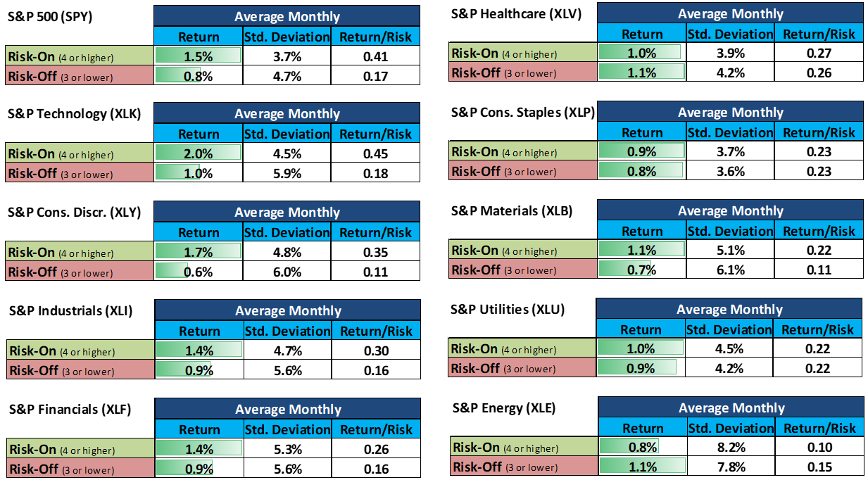
Markets do not reward the same exposure in every environment. That sounds obvious. Yet many back-tests still collapse every month into one full-history average, as if a Risk-On Goldilocks market presents the same allocation problem as Risk-Off Inflation.
It does not.
At LOGIC Macro Regime, we care about return, but we also care about the amount of risk taken to earn it. A high return may reflect genuine efficiency, or it may simply be compensation for accepting much wider swings. That distinction matters when the objective is not to find one exciting ticker, but to maintain a diversified portfolio suited to the environment we are in and the environment our six-month macro path suggests may come next.
That is why we built the LOGIC Back-Test Analyzer.
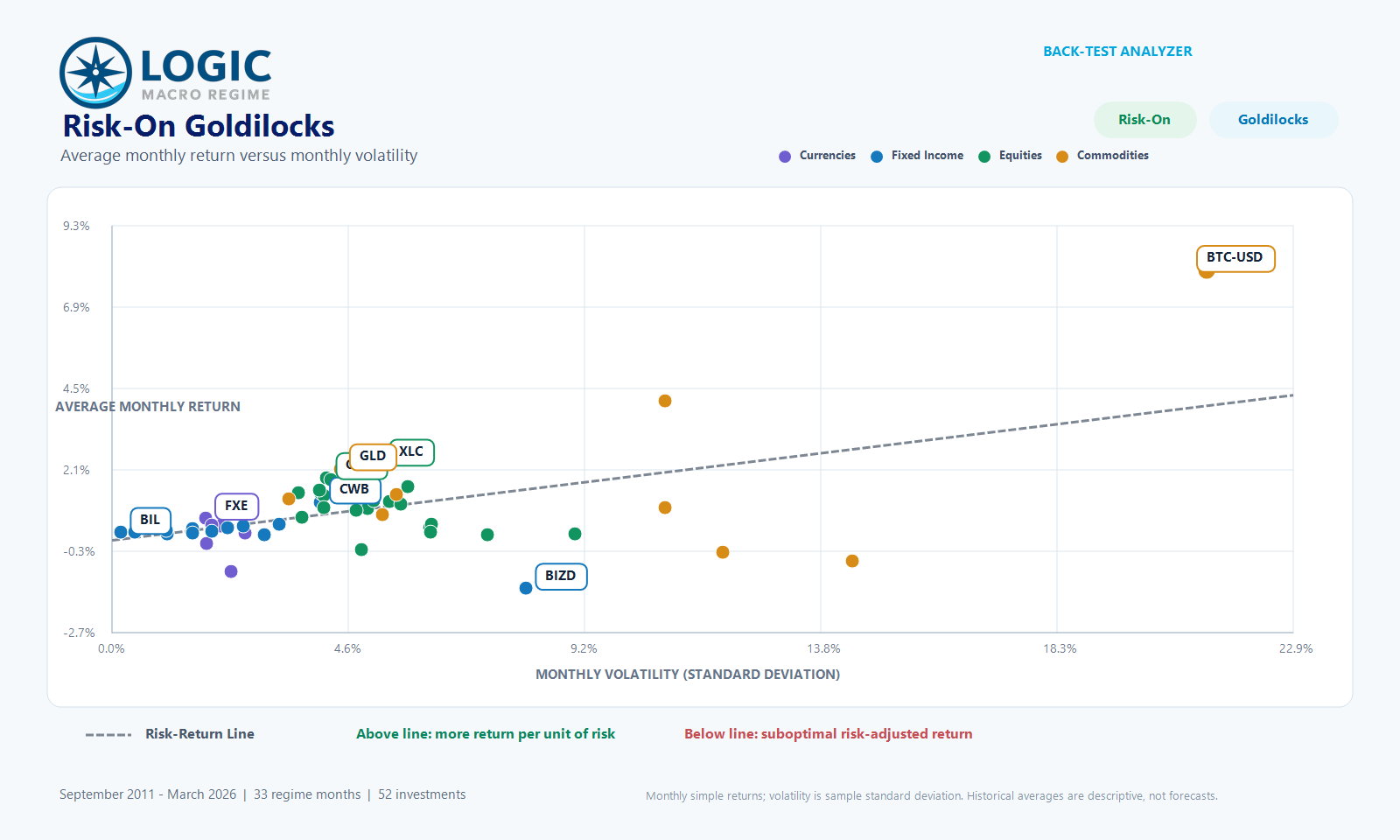
The Analyzer compares 52 investments spanning six currencies, 13 fixed-income exposures, 24 equity exposures and nine commodity exposures.
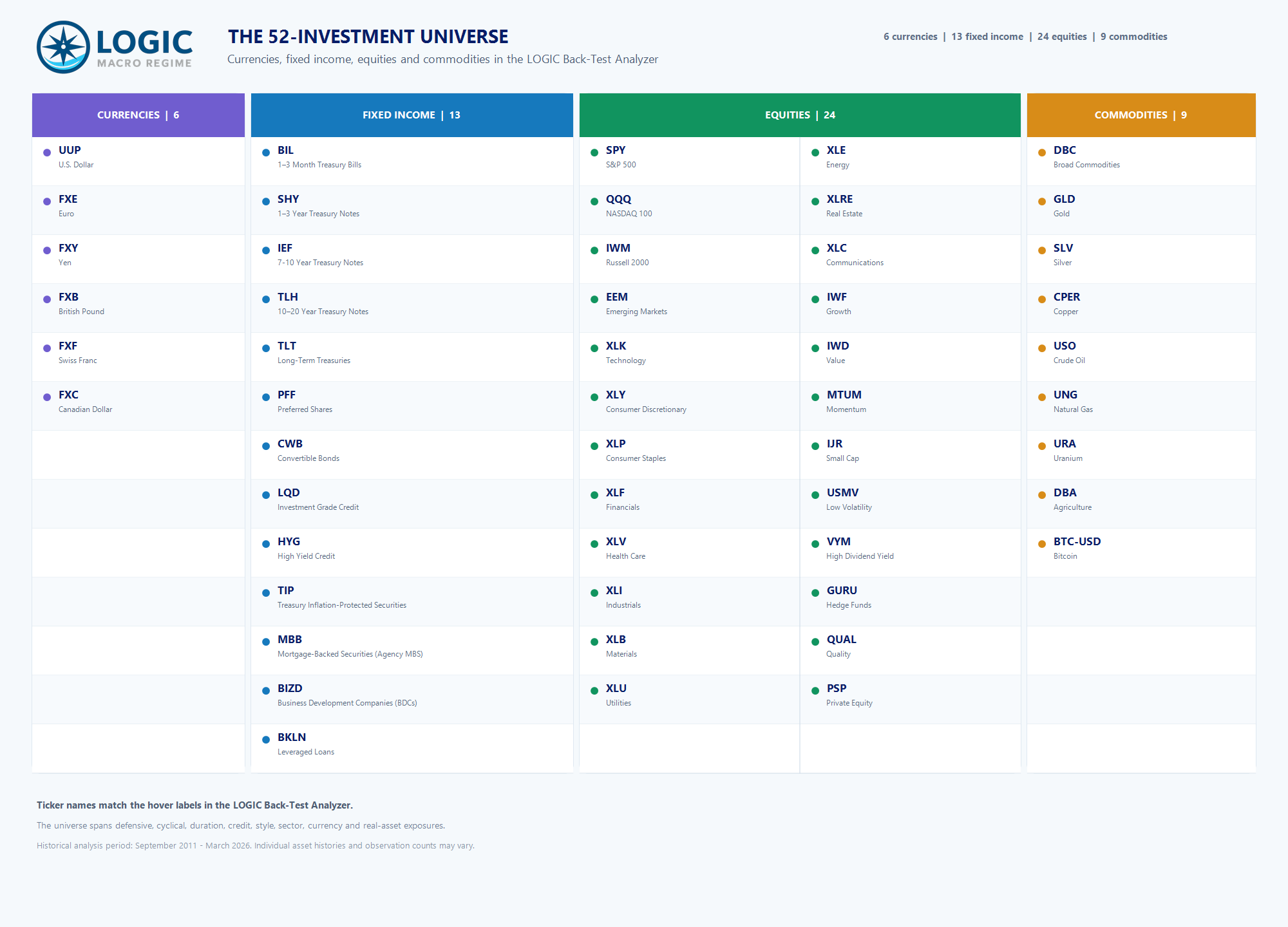
It separates the history into the eight combinations of our Risk Bias and Macro Regime frameworks:
- Risk-On and Risk-Off Goldilocks
- Risk-On and Risk-Off Reflation
- Risk-On and Risk-Off Inflation
- Risk-On and Risk-Off Deflation
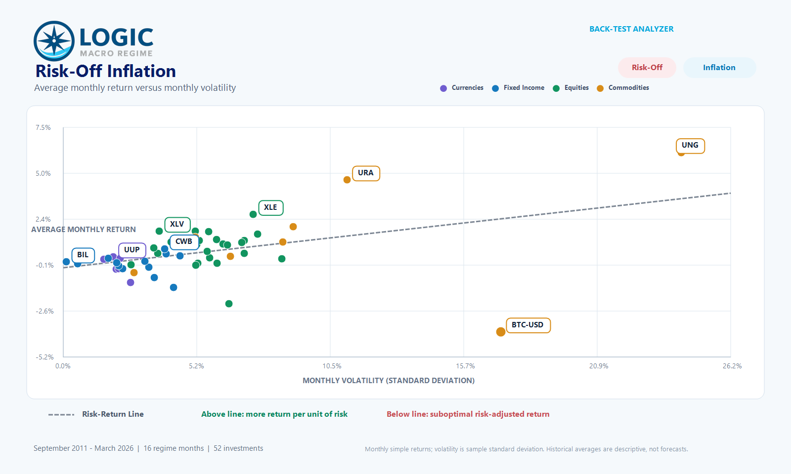
For every selected environment, the dashboard calculates average monthly return, the sample standard deviation of monthly returns, and the return-to-volatility ratio. It also plots every investment on a common risk-return map. The dotted gray Risk-Return Line provides a quick visual reference: points above it delivered more return than the cross-sectional relationship with volatility would suggest; points below it were comparatively less efficient.
Return without context can be an expensive number
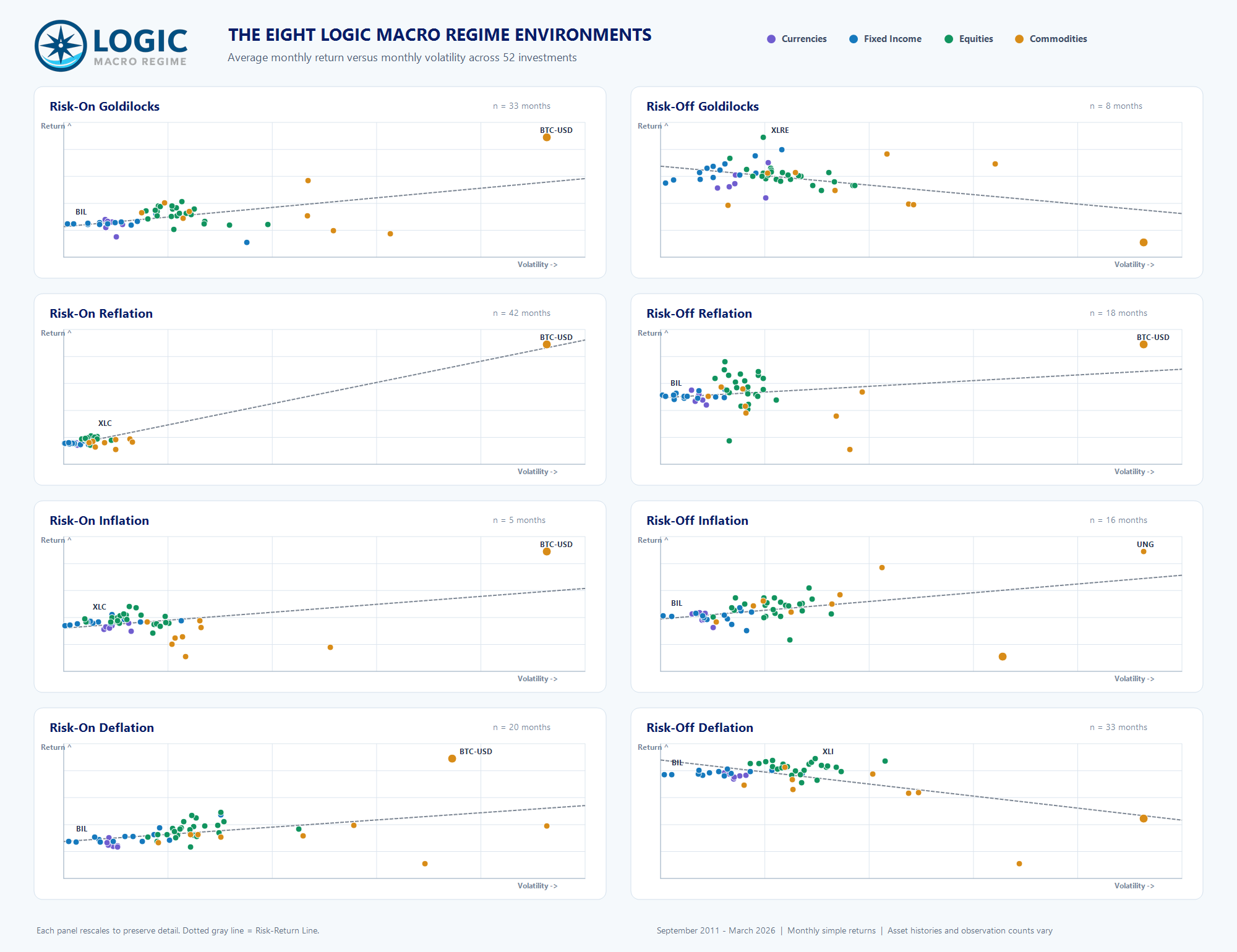
Risk-On Goldilocks offers a clean example. Bitcoin generated the highest average monthly return in the bucket at 7.98%. But it did so with monthly volatility above 21%. The highest return-to-volatility ratio belonged instead to 1–3 Month Treasury Bills (BIL) at 1.39.
That does not mean Treasury bills were the “better investment” for every objective. It means the two assets answered different questions:
- Bitcoin maximized average return.
- Treasury bills maximized average return per unit of measured volatility.
Within the same Risk-On Goldilocks environment, the leadership changed again by asset class. Communications (XLC) led equities on raw return at 2.26% per month, while the NASDAQ 100 (QQQ) produced the strongest equity return-to-volatility ratio at 0.45. Convertible bonds (CWB) led fixed income on return at 1.14%, but Treasury bills were far more efficient by the ratio. Bitcoin led the commodity bucket on return, while gold (GLD) led that bucket on risk-adjusted return at 0.48.
This is precisely why we do not reduce portfolio construction to a leaderboard. A diversified portfolio needs return engines, stabilizers and exposures that behave differently as the macro backdrop changes.
Leadership changes when the regime changes
The contrast becomes especially clear in Risk-Off Inflation.
Natural gas (UNG) delivered the highest average monthly return at 6.10%, followed by uranium (URA) at 4.59%. Yet URA - not UNG - had the strongest commodity return-to-volatility ratio at 0.41. In equities, energy (XLE) led on return at 2.69%, while health care (XLV) led on risk-adjusted return at 0.47. Long-term Treasuries (TLT) averaged -1.33% per month, and communications (XLC) averaged -2.22%. Bitcoin, so dominant in several Risk-On environments, averaged -3.79% in this bucket.
Meanwhile, Treasury bills again had the highest overall return-to-volatility ratio at 0.56.
The lesson is not that one should always prefer the lowest-volatility asset. It is that the composition of return matters. Risk-Off Inflation historically rewarded a very different combination of exposures than Risk-On Goldilocks or Risk-On Reflation.
A compact field guide to the eight environments
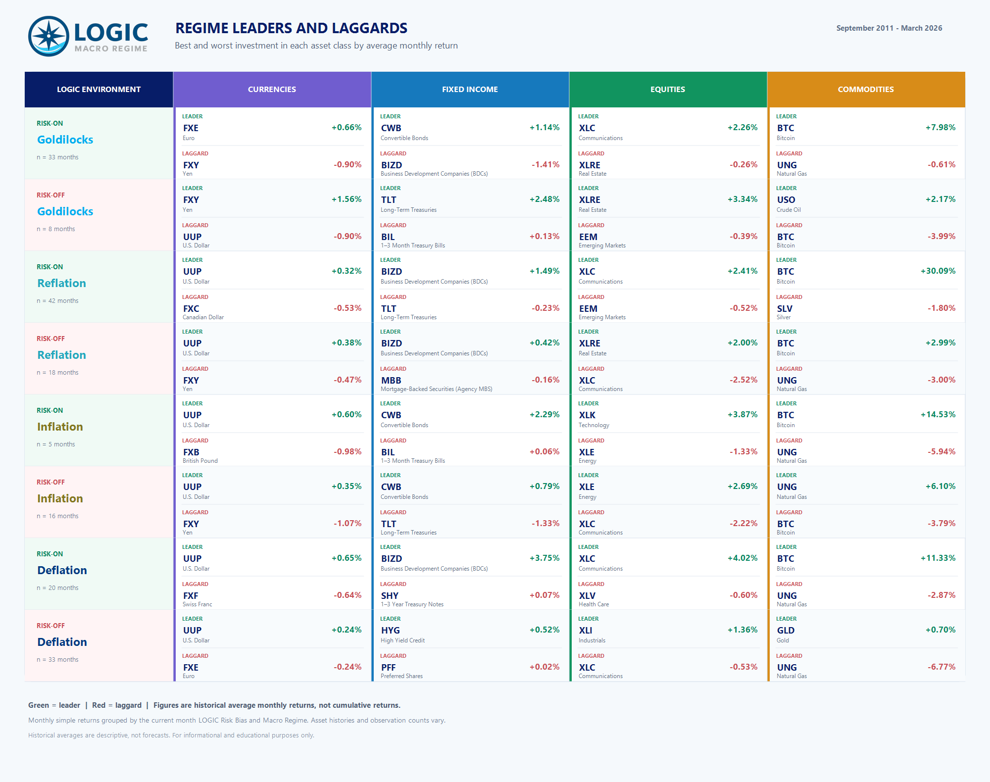
The graphic below shows the best and worst performer in each asset class by average monthly return. It is not a recommended portfolio; it is a reminder of how sharply leadership has rotated.
Several patterns are worth noting.
First, the US dollar (UUP) led the currency sleeve in six of the eight environments. The two exceptions were both Goldilocks states: the euro (FXE) led in Risk-On Goldilocks, while the yen (FXY) led in Risk-Off Goldilocks.
Second, equity leadership was highly conditional. Communications led three Risk-On buckets; real estate led both Risk-Off Goldilocks and Risk-Off Reflation; technology led Risk-On Inflation; energy led Risk-Off Inflation; and industrials led Risk-Off Deflation. “Buy equities” is not a sufficiently precise conclusion when sector behavior can diverge this much.
Third, the fixed-income sleeve shows why return and risk-adjusted return must be viewed together. Treasury bills ranked first on return-to-volatility in five of eight environments, even though they rarely led fixed income on raw return. In Risk-On Reflation, leveraged loans (BKLN) were the fixed-income risk-adjusted leader; in Risk-On Inflation, convertible bonds held that distinction.
Finally, Bitcoin led the commodity bucket on raw return in all four Risk-On environments, but its behavior was far less reliable when Risk Bias turned negative. In Risk-Off Inflation it was the worst commodity performer, while uranium offered the best commodity risk-adjusted result. In Risk-Off Deflation, gold led the commodity sleeve on both raw and risk-adjusted return.
From narrative to testable evidence
No historical average should be treated as a forecast, and the Analyzer is not a mechanical allocation model. Some regime buckets are much larger than others: Risk-On Reflation contains 42 months, while Risk-On Inflation contains only five and Risk-Off Goldilocks contains eight. Asset histories and available observations can also differ.
Those limitations are not reasons to ignore the data. They are reasons to expose the assumptions, inspect the observations and avoid false precision.
The practical workflow is straightforward:
- Use the Monthly Macro Map to identify the current LOGIC Macro Regime and Risk Bias.
- Use the six-month path to frame the environments that may matter next.
- Use the Back-Test Analyzer to compare how currencies, fixed income, equities and commodities historically behaved in those environments.
- Evaluate raw return, volatility and risk-adjusted return together.
- Build a diversified portfolio deliberately - rather than relying on whichever narrative is loudest.
The dashboard makes this process fast. Subscribers can toggle environments and date ranges, isolate asset classes, sort the leaderboard by return, volatility or return-to-volatility, and hover over any investment for its full name and statistics. The data will be refreshed monthly as the Monthly Macro Map is updated.
The goal is not to provide a single “correct” holding. It is to make the trade-offs visible and to let evidence, rather than narrative, lead the conversation.
Access to the full Back-Test Analyzer is included with a LOGIC Monthly Macro Map subscription.
View the public Back-Test Analyzer preview
Already a subscriber? Sign in to the Monthly Macro Map
Methodology: Monthly simple returns are calculated from consecutive month-end prices and grouped by the current month’s Risk Bias and Macro Regime. Volatility is the sample standard deviation of monthly returns. Blank source prices are excluded pairwise; no missing values are filled. Return-to-volatility is average monthly return divided by monthly standard deviation; it is not a Sharpe ratio. Historical averages are descriptive, not forecasts. This material is for informational and educational purposes only and does not constitute investment advice.